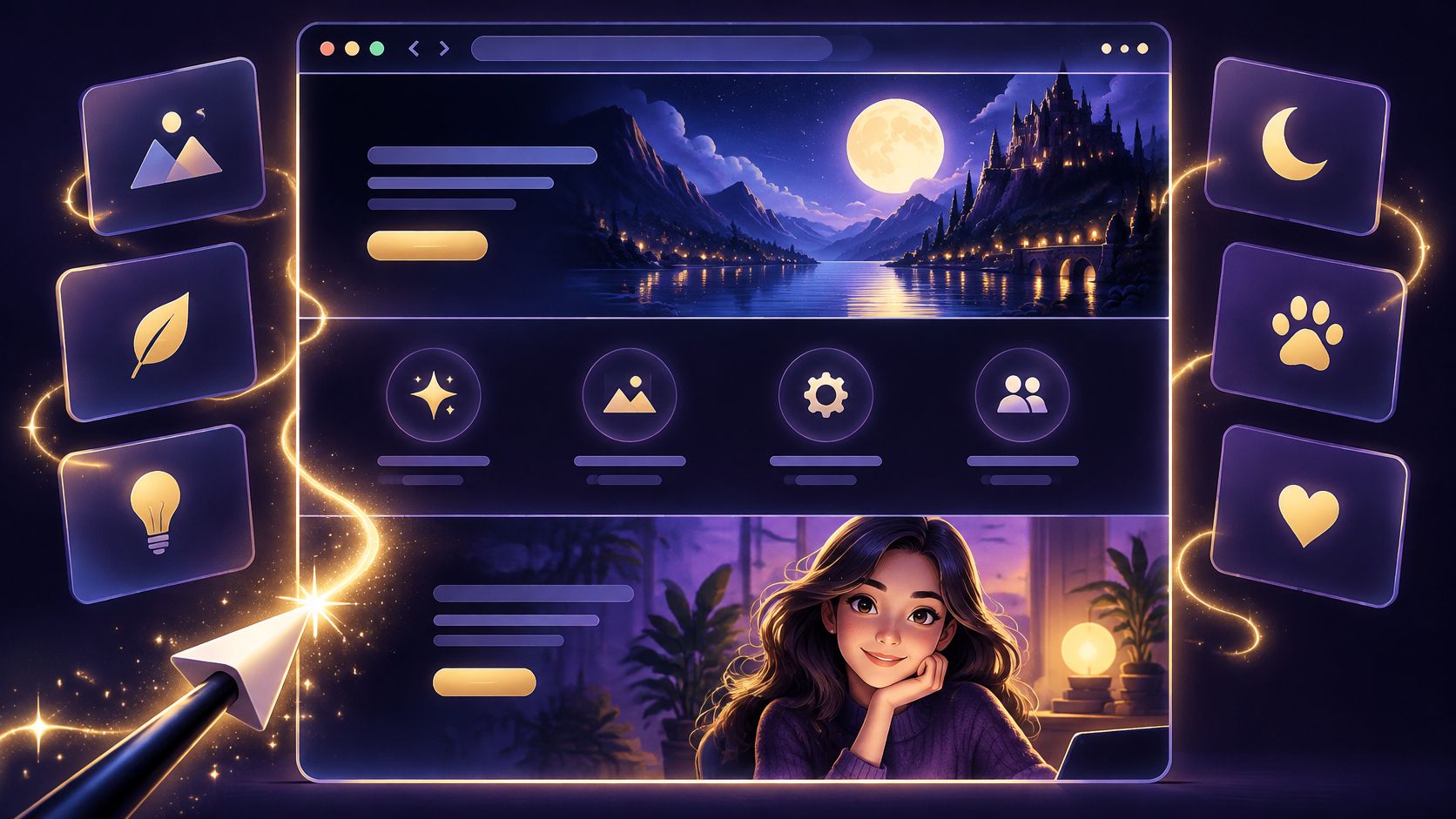
It's midnight, your landing page has a blank hero area, your feature grid has no icons, and your About page introduces absolutely nobody. The copy's ready. The publish button is waiting. All you're missing is a small bag of visual magic.
Good AI image generation prompts give those empty spaces a direction. A glowing tower can frame a webinar invitation. A pixie carrying a shield can represent security. A friendly mage can introduce your studio without pretending to be an employee.
Consider these ten spells for summoning better images onto your pages, with one important twist: each starts with where the image belongs. A gorgeous dragon isn't much help if its wing covers your call to action.
You'll get copy-ready patterns with bracketed fields to replace, placement rules, and warnings about where an attractive illustration could mislead. Keep your page copy as real text, your product claims grounded, and your wand pointed away from the checkout button.
Table of Contents
- 1. The Wizard's Tower at Dusk for Cinematic Hero Banners
- 2. Dragon-Forged Product Shots for E-Commerce
- 3. Pixie Icon Sets for Feature Sections
- 4. The Mage Portrait for Team and About Page Imagery
- 5. Enchanted Course Thumbnails for Webinars and Funnels
- 6. Potion Bottle Mockups for Subscription and Wellness Brands
- 7. Alchemist's Seasonal Campaign Backgrounds
- 8. Mythic Mascots for SaaS Onboarding
- 9. Spellbook Blog Headers and Social Preview Images
- 10. Warlock's Workshop Backgrounds for Data Visuals
- How the ten magical prompt types compare by use case, placement, and risk
- Cast Your First Prompt and Let the Page Do the Rest
1. The Wizard's Tower at Dusk for Cinematic Hero Banners
A tower glows above a misty valley. Your webinar headline sits beside it, readable against an uncluttered twilight sky. That's a hero banner doing its job: setting the mood while leaving room for the invitation.
Use this treatment for a course launch or a wizard's-observatory metaphor on an analytics landing page.
Copy-ready prompt
Create a wide cinematic illustration of a wizard's stone tower at dusk for [offer]. Place the tower on the right, with glowing amber windows, distant violet mountains, and restrained mist. Leave empty space on the left third for headline text. Use [brand palette], soft atmospheric lighting, and a quiet background. No lettering, logos, or watermarks.

Place your headline and button in the page layout, not inside the generated artwork. The AI landing-page generator guide offers useful context for describing the banner alongside the surrounding page.
- Placement: Check desktop and mobile crops separately so the tower doesn't wander behind the headline.
- Consistency: Save the palette, horizon position, and lighting description for related campaign pages.
- Publishing: Compare variations for the cleanest text zone, then compress the selected file.
Where it can mislead: A tower is atmosphere, not evidence. Don't let fantasy architecture imply a real campus, venue, or property included in your offer.
2. Dragon-Forged Product Shots for E-Commerce
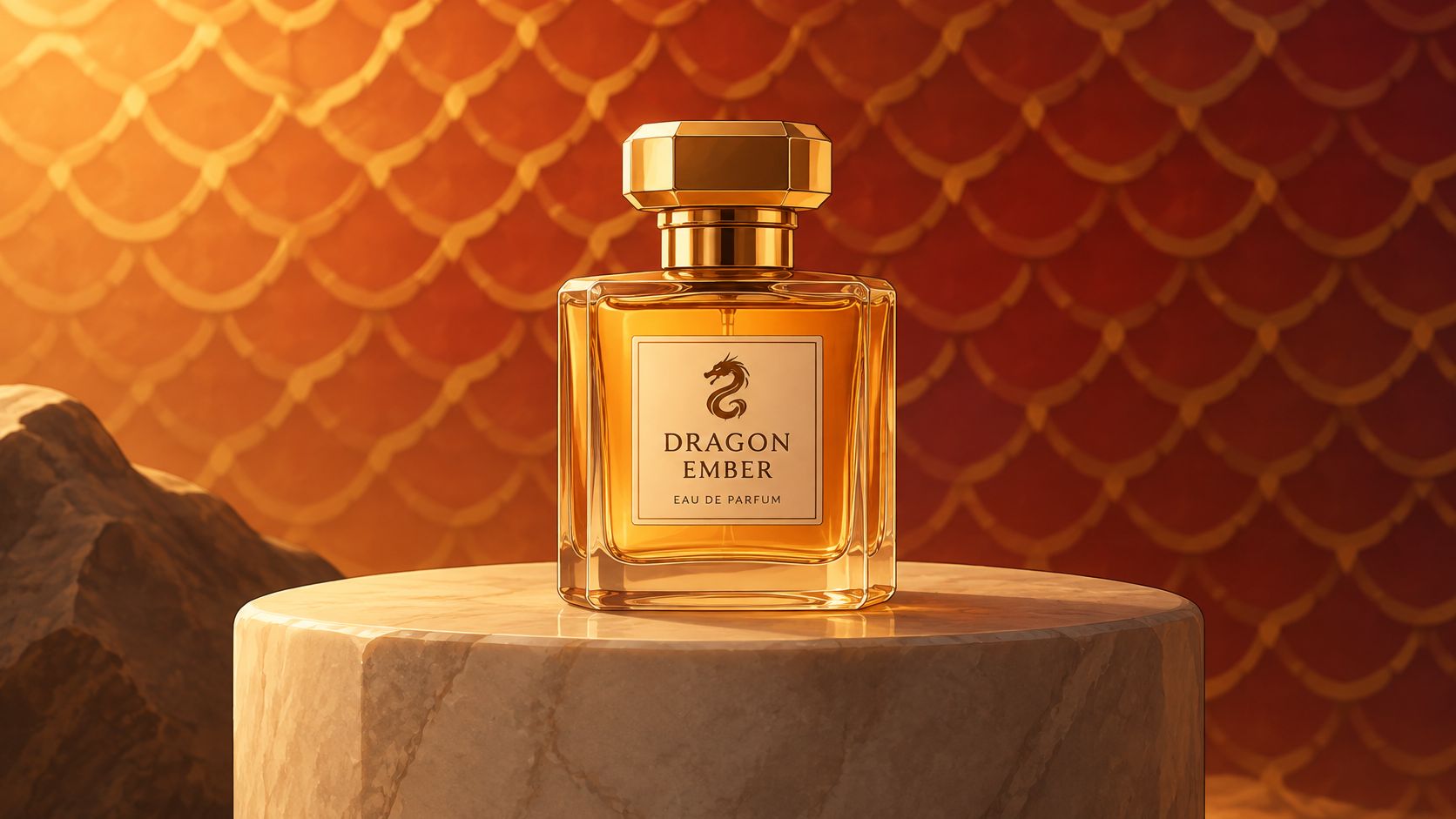
A shopper scrolling a jewelry collection pauses at a silver ring on dark stone, its edges catching a warm glint. The dragon's hoard can set the mood, but the product must stay accurate and in focus.
Build the scene around the real item
Copy-ready prompt
Create a fantasy lifestyle image featuring [exact product name], made from [exact material], resting on a dark stone display surface beside a subtle dragon's hoard. Use the supplied product reference to preserve its proportions, finish, and visible details. Add controlled studio lighting, [brand palette], and a softly blurred background. Keep treasure secondary. Do not add accessories, lettering, or packaging.
For a candle collection, trade the hoard for a warlock's workbench. Keep the camera angle and light direction consistent across scents so the images feel like one collection.
Use the fantasy scene in a collection banner or lifestyle section, alongside authentic product photographs. Keep accurate product images near purchase controls and throughout checkout.
Buyer-trust rule: If an invented detail could look like part of the item for sale, remove it or label the image clearly.
Before publishing commercial images, consider training-data questions separately from how customer uploads are handled. Adobe's generative-AI approach describes both considerations, including licensed training material and customer content.
3. Pixie Icon Sets for Feature Sections
Your security pixie carries a shield. Your support pixie holds a lantern. Your speed pixie has apparently discovered espresso.
Together, they can give a feature grid character without turning it into a crowded enchanted forest. The trick is to change the symbol, not the illustration system.
Copy-ready prompt
Create a small pixie icon representing [feature] through [simple visual symbol]. Flat vector style, plain background, centered subject, rounded silhouettes, consistent line weight, limited [brand palette], gentle expression, minimal detail, no lettering. Match the attached approved style reference. Keep the symbol readable at the intended display size.
- Lock the style sentence: Paste the same visual instructions into every prompt.
- Vary the meaning: Use a shield for security, a lantern for guidance, or a winged parcel for delivery.
- Check the actual size: Export and inspect icons where they'll appear, not just enlarged in the generator.
A freelancer's services page might pair these icons with design, copy, SEO, and hosting labels. Keep those labels visible, because visitors shouldn't need to decode pixie symbolism to understand the offer; this index-page example guide can help you think through the surrounding hierarchy.
Where it can mislead: A shield icon doesn't prove certification or guarantee security. Describe the actual feature beneath it.
Adobe's Firefly enterprise FAQ explains that descriptive wording guides output relevance. For icons, concrete objects give you a clearer starting point than vague requests for something magical and professional.
4. The Mage Portrait for Team and About Page Imagery
A robed mage smiles beside your studio introduction. They're welcoming, slightly eccentric, and clearly illustrated. Nobody mistakes them for your head of operations.
That distinction matters. A brand character can introduce your personality; it shouldn't invent your team.
Copy-ready prompt
Create an openly illustrated mage avatar representing [studio or brand personality], not a real employee. Show a warm expression, [specified hairstyle and facial features], a simple robe in [brand palette], and [signature accessory]. Use an editorial illustration style, soft lighting, and a plain background. Keep costume, proportions, and rendering consistent with the approved character reference. No photorealism or lettering.
Put the person before the persona
For a freelance studio, place the avatar near a founder biography, with the founder's real name and photograph available alongside it. A coaching business could reuse its illustrated mentor in welcome emails, clearly presenting it as a guide character.
Don't generate realistic likenesses of real people without their consent. When commissioning varied characters, also inspect clothing, occupations, settings, and expressions rather than treating demographic labels as a complete representation strategy.
A study of representation across image-generation tools found that identity-specific prompts could still reproduce racial and class stereotypes. Review candidates for those associations before publishing.
Where it can mislead: Never attach an invented portrait to a testimonial, staff biography, professional credential, or named customer. A charming wizard still needs an honest introduction.
5. Enchanted Course Thumbnails for Webinars and Funnels
A blue spellbook opens, light spills across the cover, and your sales-script webinar suddenly has a visual identity. The book supplies the atmosphere. Your actual title supplies the meaning.
For educational offers, reuse the same cover throughout the funnel so visitors can recognize what they registered for.
Copy-ready prompt
Create an illustrated course-cover background for [offer topic], featuring [spellbook, crystal orb, or scroll] as the central object. Use [brand palette], restrained magical lighting, and a clean high-contrast area reserved for the title. Keep important details away from crop edges. No generated text, badges, seals, or logos. Match [approved campaign style].

A coach could use a spellbook for a sales-script workshop and an orb for a forecasting class. Preserve the lighting, typography placement, and palette while changing the central object.
- Landing page: Show the cover beside the offer description.
- Checkout: Repeat the approved thumbnail to confirm the purchase.
- Confirmation page: Pair it with access instructions, using these thank-you page examples for layout ideas.
Add the title afterward in your design tool and inspect it at mobile size. Test a different central object without simultaneously rewriting the offer.
Where it can mislead: Don't depict a physical boxed course, printed workbook, or certification seal unless buyers receive it. Spellbook artwork shouldn't add imaginary deliverables.
6. Potion Bottle Mockups for Subscription and Wellness Brands
Your skincare formula isn't bottled yet, but your waitlist page needs something better than an empty rectangle. An illustrated potion concept can explain the intended direction without pretending the finished package exists.
Use this spell for pre-launch exploration, not proof of product performance.
Keep the concept visibly conceptual
Copy-ready prompt
Create a clearly illustrated packaging concept for [product category], showing a [bottle shape and material] containing [color description]. Place it on a simple apothecary shelf with soft studio lighting and [brand palette]. Leave the label area blank for later typesetting. No medical symbols, certification marks, ingredient claims, before-and-after comparisons, or implied therapeutic effects. Present as concept artwork, not a finished product photograph.
A skincare founder could compare frosted glass with amber glass while keeping the page copy unchanged. A tea subscription could use potion-inspired illustrations in welcome emails without suggesting the actual tea glows.
- Placement: Put a visible concept illustration label near the image on a waitlist page.
- Consistency: Keep bottle proportions, camera angle, and label position fixed while exploring finishes.
- Typography: Overlay accurate label text in a design tool rather than generating it inside the image.
Where it can mislead: A luminous liquid can imply unusual ingredients or benefits. Avoid imagery suggesting healing, transformation, or results you can't substantiate.
If you test conversion before committing to packaging, remember what you've learned: interest in that presentation and message, not validation of a formula or a promise that the product works.
7. Alchemist's Seasonal Campaign Backgrounds
Frost gathers on the laboratory windows. The cauldron has moved beside a winter sale headline, and your layout hasn't changed at all.
Seasonal backgrounds work best as replaceable scenery, not a reason to rebuild a useful page.
Copy-ready prompt
Create a low-detail seasonal background for a [campaign type] page, showing an alchemist's workspace during [season]. Include [seasonal objects] around the outer edges, with an uncluttered central area behind page copy. Use muted [brand palette], soft lighting, and restrained texture. No lettering, discount labels, clocks, product claims, or prominent foreground objects.

An online apothecary could use dried herbs and copper vessels for an autumn promotion. A coaching site might choose a sunlit garden and quiet cauldron for spring enrollment.
Keep the focal objects away from prices, form fields, and buttons. Compress the background before publishing, and schedule its removal with the campaign rather than leaving seasonal decorations behind indefinitely.
A background should be easy to ignore while someone reads the offer.
Where it can mislead: Decorative clocks and urgent-looking sale imagery can suggest a deadline that doesn't exist. Keep promotion dates and availability in accurate page copy.
For controlled revisions, change the season while preserving composition and palette. A study of image-model steerability found that repeated refinement wasn't reliably successful, supporting a more disciplined approach than endlessly adding descriptive words.
8. Mythic Mascots for SaaS Onboarding
A small dragon points toward the import button. Later, it curls beside an empty dashboard, waiting for the first project.
That's a useful mascot: expressive enough to welcome someone, quiet enough to let them finish setup. It shouldn't require users to attend a dragon performance before accessing their account.
Copy-ready prompt
Create an onboarding illustration of our approved [dragon or sprite] mascot performing [single action]. Preserve its [body shape], [colors], [distinctive markings], and [accessory] exactly as shown in the character reference. Use simple shapes, a transparent or plain background, and a clear silhouette. Keep the expression [emotion]. No interface elements, lettering, or extra characters.
Establish the character before the screens
Approve a character sheet with useful poses such as welcoming, pointing, celebrating, and waiting. Then generate screen-specific illustrations from that reference rather than reinventing the creature each time.
- Placement: Use small images beside onboarding instructions, empty states, or help content.
- Consistency: Record the model version, reference assets, settings, and accepted outputs.
- Testing: Compare mascot presence with a version without it, using completed setup as the outcome.
A study of AI-generated visual vignettes describes reproducibility problems involving phrasing, generation settings, and model changes. Treat approved files as assets worth keeping, not results you can always summon again.
Where it can mislead: Don't let a cheerful mascot imply an import succeeded when it failed. Status text and recovery instructions must remain explicit.
9. Spellbook Blog Headers and Social Preview Images
An orb reflects a simple chart for your analytics article. A floating scroll marks your copywriting guide. Your blog has a recognizable style without repeating the same unrelated wizard on every post.
The best AI image generation prompts for editorial work connect a visible object to the actual subject.
Copy-ready prompt
Create an editorial header illustration for an article about [specific topic]. Use [relevant magical object] to represent [central concept], with [supporting visual detail]. Match our [brand palette] and [fixed illustration style]. Keep the main subject recognizable when cropped for social previews. Leave optional title space uncluttered. No lettering, fabricated screenshots, logos, or numerical claims.
For a marketing agency, an organized spellbook could represent content planning. A scrying orb with branching paths might suit attribution, provided the article explains the subject rather than relying on the metaphor.
- Placement: Preview the artwork both above the article and in social sharing crops.
- Consistency: Fix the lighting and palette, then vary the topic-specific object.
- Accessibility: Write descriptive alt text for meaningful images; use empty alt text for purely decorative ones.
Export to the destination platform's current social-card specifications and compress before publication. Don't assume a beautiful header will improve search rankings or clicks without measuring the result.
Where it can mislead: A fabricated dashboard can look like product evidence. Use actual screenshots when explaining real functionality, and preserve provenance information where supported; Adobe's Firefly FAQ describes Content Credentials for recording creation and editing information.
10. Warlock's Workshop Backgrounds for Data Visuals
A faint star map sits behind a case study chart. Visitors notice the result first and the celestial decoration afterward.
That order is essential. Generate the atmosphere, never the evidence. Your chart values, labels, and comparisons belong in real page elements or a charting tool.
Copy-ready prompt
Create a subtle abstract background for a [case study chart, analytics section, or pricing comparison]. Use faint star-map lines and restrained arcane geometry in [brand palette] against a plain [background color] field. Keep the central data area nearly empty. No numbers, letters, chart marks, axes, badges, or implied trends. Low contrast, minimal texture, no bright focal points.
A freelancer's case study could place this artwork behind a genuine results chart. A pricing page might use a restrained rune pattern outside the plan table, leaving prices and feature comparisons on a solid surface.
Keep the chart in charge
Reduce the artwork's opacity until labels remain easy to read. Use a consistent background pattern across the page, and verify text contrast with an accessibility checker.
Evaluate aesthetics separately from accuracy. The Human Preference Score v2 paper distinguishes human-preference evaluation from simple prompt-image similarity, a useful reminder that matching your prompt doesn't automatically make an image suitable for publication.
Where it can mislead: Decorative upward lines can suggest growth even without numbers. Avoid background shapes that resemble extra data series, and never present generated metrics as actual business results.
How the ten magical prompt types compare by use case, placement, and risk
| Item | Best For | Where It Goes | Main Risk |
|---|---|---|---|
| The Wizard's Tower at Dusk: Cinematic Hero Banners | Setting a magical brand mood | Landing page hero section | Fantasy imagery may feel off-brand or reduce text contrast |
| Dragon-Forged Product Shots for E-Commerce | Eye-catching product lifestyle imagery | Product pages and ads | AI may misrepresent product details and mislead customers |
| Pixie Icon Sets for Feature Sections | Making feature lists more engaging | Feature grids and services pages | Style drift or fine details can hurt consistency and legibility |
| The Mage Portrait: Team and About Page Imagery | Creating a friendly illustrated brand character | About pages and social media | Illustrations may feel impersonal when used instead of real team photos |
| Enchanted Course Thumbnails for Webinars and Funnels | Building a consistent look for educational offers | Course covers, landing pages, and funnels | Busy art can make titles hard to read |
| Potion Bottle Mockups for Subscription and Wellness Brands | Testing early product concepts | Pre-launch pages, product cards, and emails | Generated labels may be inaccurate; imagery cannot substantiate health claims |
| Alchemist's Seasonal Campaign Backgrounds | Refreshing promotions for holidays or launches | Campaign pages and site backgrounds | Busy or frequent changes can hurt readability and visitor familiarity |
| Mythic Mascots for SaaS Onboarding | Making onboarding and empty states feel friendlier | Product screens, tooltips, and emails | Character consistency is difficult, and playful art may not suit enterprise users |
| Spellbook Blog Headers and Social Preview Images | Giving articles distinctive share visuals | Blog headers and social cards | Generic imagery can look repetitive or misrepresent specific topics |
| Warlock's Workshop: Abstract Backgrounds for Data Visuals | Adding subtle visual interest to data-heavy pages | Dashboards, case studies, and pricing sections | Busy patterns can reduce chart legibility and distract from metrics |
Cast Your First Prompt and Let the Page Do the Rest
Start with a hero banner and a matching icon set. That gives you a prominent visual direction and a repeatable system for smaller details, without commissioning an entire fantasy kingdom before lunch.
Write a fixed style sentence that describes your palette, rendering style, lighting, and level of detail. Reuse it across your AI image generation prompts, changing only the subject and placement instructions when the page needs something new.
Keep a clear text zone in every image that will sit behind copy. Add headlines, prices, labels, and calls to action as real text, then check the finished page on mobile before you approve the artwork.
Make the spell repeatable
Save more than the prompt. Keep the approved image, reference files, model and version, available generation settings, crop, and editing notes together so a teammate can understand how the asset was made.
- Keep: Images that support the offer, remain readable in context, and accurately represent what visitors will receive.
- Swap: Images with distracting detail, awkward crops, inconsistent characters, or confusing visual metaphors.
- Retire: Outdated seasonal artwork, rejected product concepts, and illustrations that no longer match the page's claims.
Compress each published image and inspect it in the actual layout. A gorgeous full-size export isn't the finished asset if its mobile crop hides the product or its texture makes the button hard to find.
Treat every generated visual as a test, not a sacred relic. Compare candidates against explicit requirements before you test audience response: correct subject, usable composition, honest implications, accessible presentation, and a clear relationship to the offer.
For commercial work, add a final human review. Someone should check product accuracy, representation, rights considerations, and any suggestion that the illustration depicts a real person, event, or result.
If you want the copy, layout, and imagery to arrive together, Web Mage generates a full page from a plain-language description for about 60 credits. You can refine it through chat, and its Conversion Alchemist runs split tests, promotes winning variants when significance is reached, and retires losing versions automatically.
The goal isn't to fill every corner with sparks. It's to give visitors a page they can understand, trust, and use, with just enough magic to make it memorable.
Turn your hero-banner prompt into a complete page with Web Mage, which generates pages, copy, imagery, and layout from a plain-English description. Describe your offer, palette, and empty headline space, then refine the result through chat until your page is ready for its grand entrance.